
UX
B2B2C
Digital Marketing
CRO
Proven Layout
Oozle Media's clients — beauty schools across 4 states — were losing prospective students at the form. The existing website template was years old, underperforming on conversion, and full of friction we could see in the data. I led a research-to-prototype redesign of the Proven Layout template to increase enrollment inquiries across every client site.
My role
UX Designer
timeline
3 Months
team
Dev team, Copywriter
tools
Figma, HotJar
overview
The Challenge
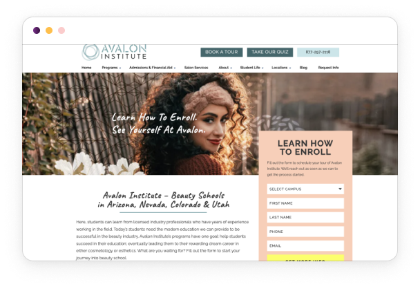
Oozle Media builds and manages websites for beauty school clients. Their bread-and-butter product is the Proven Layout — a conversion-optimized website template used across their entire client base. The template had been in use for years without a meaningful update, and HotJar data was showing clear signs of friction: forms weren't being filled out, CTAs weren't being clicked, and users were navigating in circles on program pages.
The business goal was straightforward: more form submissions means more enrolled students, which means better results for clients. But we needed data to know what to fix — not just assumptions.
Key metrics:
- Clients served: 25+ beauty school sites
- Audience: Prospective students, predominantly female, ages 16–25, across Utah, Arizona, Nevada, and Colorado
- Timeline: 3 months research through prototype
research
Understanding the users
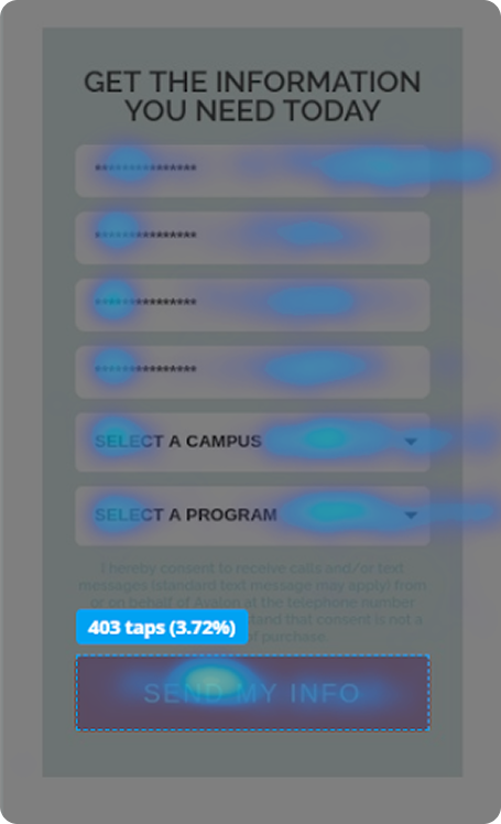
We used HotJar to run behavioral analysis across client sites — click maps, scroll maps, and on-site surveys — to identify where users were dropping off and why. The goal was to find patterns across multiple client sites rather than optimize for just one.
1
Subheader forms blended into the page. Users weren't seeing the primary lead capture form — it looked like part of the design, not an action item
2
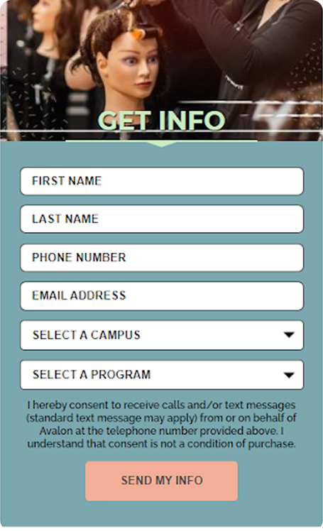
Horizontal forms converted worse than vertical. Form layout was creating friction before users even started filling it out
3
"First Name / Last Name" first = more drop-off. Starting with personal info felt invasive. Starting with "Campus of Interest" and "Program of Interest" increased completions
4
Header CTAs were too high on desktop. Users scrolled past them without registering them as clickable
5
Mobile CTAs looked like banners. Users weren't tapping buttons on mobile because they visually read as decorative images
6
Program pages listed the current program in the "other programs" section. Users on the Cosmetology page would click the Cosmetology "Learn More" link — sending them to a page they were already on
Key insight: Most of the friction wasn't copywriting or branding — it was structural. Small layout and ordering decisions were quietly killing conversions across every client site.
define
Who we were designing for
Primary users: Prospective beauty school students, ages 16–25, researching programs across multiple school locations. They're comparison shopping — checking multiple schools, on mobile, often making an emotionally charged decision about their career.
Problem statement: How might we redesign the Proven Layout template so that prospective students can quickly find what they need, trust what they see, and take action — regardless of which client site they're on?
Design
From concepts to prototype
With findings in hand, I moved into a phased design approach: sitemap first, then prototype.
Phase 2 : Template Sitemap Before touching a single screen, I mapped a standardized template sitemap based on what we knew about cosmetology school content needs. Making this reusable meant any member of the Oozle team could spin up a new client site without starting from scratch — it built institutional knowledge into the system itself.
Phase 3: Prototyping I redesigned the template systematically across every major surface area:
Site-wide changes:
- Repositioned header buttons lower and inline with the logo so they register as interactive on both desktop and mobile
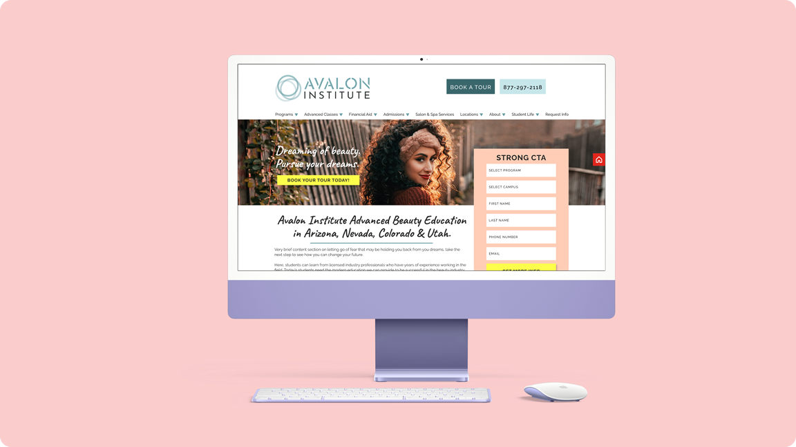
- Introduced a vertical overlapping form in the subheader that pulls visual attention and encourages scroll
- Added full-width CTA bars that break out of the content column — impossible to miss once colorized per client brand
- Added photos to the testimonials section — data showed students found reviews with faces more trustworthy and credible
Program pages:
- Removed the current program from the "other programs" module — users can no longer accidentally click a link to the page they're already on
- Added recommended content sections to give the content team structured spots to write conversion-focused copy
Location pages:
- Added hours, address, and contact info per location — information students repeatedly searched for
- Replaced a long scrolling program list with a tabbed menu for salon services and prices, dramatically improving mobile usability
Template expansion: Expanded the deliverable from 2 pages (home + programs) to a full suite: Locations, Salon Services, Contact Us, Enrollment, and a Master Page — a reference canvas with every element available to duplicate, reorder, and reuse for new pages.
validate
Testing & iteration
HotJar remained active post-launch on client sites as the ongoing validation mechanism. Rather than a single usability study, this project used continuous behavioral data as its feedback loop — click rates, scroll depth, and form completion rates across live client traffic.
The form field order change (Campus → Program first, rather than First Name → Last Name first) was directly validated by CRO report data showing improved completion rates when lower-commitment questions led the form.
Final Design
The solution
The redesigned Proven Layout shipped as a flexible, client-agnostic template. The two most impactful screens:
Subheader + Lead Form: The new vertical overlapping form replaced the flat horizontal form. Visually distinct from the page, positioned to catch users before they scroll past the fold, and re-ordered to start with interest rather than identity.
Location Page: Consolidated hours, address, and contact info in one place. Tabbed salon services replaced a long scroll — cutting the time to find pricing on mobile significantly.
The Master Page was the highest-leverage deliverable — a single Figma canvas containing every site element, organized so any designer or developer at Oozle could build new pages without tribal knowledge.
outcomes
Results & impact
Redesigning a template used across 25+ active client sites means the improvements compounded — every change multiplied across every client's traffic simultaneously. The new template generated more leads than the previous version, with form completion improving directly as a result of the field reordering and visual form treatment changes.
Beyond the immediate conversion improvements, the template expansion gave clients more pages, more flexibility, and less dependency on the Oozle team for ongoing changes — reducing support overhead while improving client outcomes.
Reflection
What I learned
The biggest learning from this project was that the most impactful UX fixes are often invisible to the client. Nobody noticed that we changed the form field order or repositioned a button by 40 pixels — but those changes moved the needle more than a full visual redesign would have.
If I were to do this again, I'd push harder for a controlled A/B test on the form field ordering specifically — the data was directional but not conclusive, and a proper split test would have given us a defensible percentage lift to report back to clients.
Next steps: Continue running HotJar across all client sites post-launch to track ongoing conversion performance and identify the next round of improvements. The template should be treated as a living product, not a one-time deliverable.
© 2025 Savannah Nyre. All rights reserved.
Designed & built with intention.
UX
B2B2C
Digital Marketing
CRO
Proven Layout
Oozle Media's clients — beauty schools across 4 states — were losing prospective students at the form. The existing website template was years old, underperforming on conversion, and full of friction we could see in the data. I led a research-to-prototype redesign of the Proven Layout template to increase enrollment inquiries across every client site.
My role
UX Designer
timeline
3 Months
team
Dev team, Copywriter
tools
Figma, HotJar
overview
The Challenge
Oozle Media builds and manages websites for beauty school clients. Their bread-and-butter product is the Proven Layout — a conversion-optimized website template used across their entire client base. The template had been in use for years without a meaningful update, and HotJar data was showing clear signs of friction: forms weren't being filled out, CTAs weren't being clicked, and users were navigating in circles on program pages.
The business goal was straightforward: more form submissions means more enrolled students, which means better results for clients. But we needed data to know what to fix — not just assumptions.
Key metrics:
- Clients served: 25+ beauty school sites
- Audience: Prospective students, predominantly female, ages 16–25, across Utah, Arizona, Nevada, and Colorado
- Timeline: 3 months research through prototype
research
Understanding the users
We used HotJar to run behavioral analysis across client sites — click maps, scroll maps, and on-site surveys — to identify where users were dropping off and why. The goal was to find patterns across multiple client sites rather than optimize for just one.
1
Subheader forms blended into the page. Users weren't seeing the primary lead capture form — it looked like part of the design, not an action item
2
Horizontal forms converted worse than vertical. Form layout was creating friction before users even started filling it out
3
"First Name / Last Name" first = more drop-off. Starting with personal info felt invasive. Starting with "Campus of Interest" and "Program of Interest" increased completions
4
Header CTAs were too high on desktop. Users scrolled past them without registering them as clickable
5
Mobile CTAs looked like banners. Users weren't tapping buttons on mobile because they visually read as decorative images
6
Program pages listed the current program in the "other programs" section. Users on the Cosmetology page would click the Cosmetology "Learn More" link — sending them to a page they were already on
Key insight: Most of the friction wasn't copywriting or branding — it was structural. Small layout and ordering decisions were quietly killing conversions across every client site.
define
Who we were designing for
Primary users: Prospective beauty school students, ages 16–25, researching programs across multiple school locations. They're comparison shopping — checking multiple schools, on mobile, often making an emotionally charged decision about their career.
Problem statement: How might we redesign the Proven Layout template so that prospective students can quickly find what they need, trust what they see, and take action — regardless of which client site they're on?
Design
From concepts to prototype
With findings in hand, I moved into a phased design approach: sitemap first, then prototype.
Phase 2 : Template Sitemap Before touching a single screen, I mapped a standardized template sitemap based on what we knew about cosmetology school content needs. Making this reusable meant any member of the Oozle team could spin up a new client site without starting from scratch — it built institutional knowledge into the system itself.
Phase 3: Prototyping I redesigned the template systematically across every major surface area:
Site-wide changes:
- Repositioned header buttons lower and inline with the logo so they register as interactive on both desktop and mobile
- Introduced a vertical overlapping form in the subheader that pulls visual attention and encourages scroll
- Added full-width CTA bars that break out of the content column — impossible to miss once colorized per client brand
- Added photos to the testimonials section — data showed students found reviews with faces more trustworthy and credible
Program pages:
- Removed the current program from the "other programs" module — users can no longer accidentally click a link to the page they're already on
- Added recommended content sections to give the content team structured spots to write conversion-focused copy
Location pages:
- Added hours, address, and contact info per location — information students repeatedly searched for
- Replaced a long scrolling program list with a tabbed menu for salon services and prices, dramatically improving mobile usability
Template expansion: Expanded the deliverable from 2 pages (home + programs) to a full suite: Locations, Salon Services, Contact Us, Enrollment, and a Master Page — a reference canvas with every element available to duplicate, reorder, and reuse for new pages.
validate
Testing & iteration
HotJar remained active post-launch on client sites as the ongoing validation mechanism. Rather than a single usability study, this project used continuous behavioral data as its feedback loop — click rates, scroll depth, and form completion rates across live client traffic.
The form field order change (Campus → Program first, rather than First Name → Last Name first) was directly validated by CRO report data showing improved completion rates when lower-commitment questions led the form.
Final Design
The solution
The redesigned Proven Layout shipped as a flexible, client-agnostic template. The two most impactful screens:
Subheader + Lead Form: The new vertical overlapping form replaced the flat horizontal form. Visually distinct from the page, positioned to catch users before they scroll past the fold, and re-ordered to start with interest rather than identity.
Location Page: Consolidated hours, address, and contact info in one place. Tabbed salon services replaced a long scroll — cutting the time to find pricing on mobile significantly.
The Master Page was the highest-leverage deliverable — a single Figma canvas containing every site element, organized so any designer or developer at Oozle could build new pages without tribal knowledge.
outcomes
Results & impact
Redesigning a template used across 25+ active client sites means the improvements compounded — every change multiplied across every client's traffic simultaneously. The new template generated more leads than the previous version, with form completion improving directly as a result of the field reordering and visual form treatment changes.
Beyond the immediate conversion improvements, the template expansion gave clients more pages, more flexibility, and less dependency on the Oozle team for ongoing changes — reducing support overhead while improving client outcomes.
Reflection
What I learned
The biggest learning from this project was that the most impactful UX fixes are often invisible to the client. Nobody noticed that we changed the form field order or repositioned a button by 40 pixels — but those changes moved the needle more than a full visual redesign would have.
If I were to do this again, I'd push harder for a controlled A/B test on the form field ordering specifically — the data was directional but not conclusive, and a proper split test would have given us a defensible percentage lift to report back to clients.
Next steps: Continue running HotJar across all client sites post-launch to track ongoing conversion performance and identify the next round of improvements. The template should be treated as a living product, not a one-time deliverable.
© 2025 Savannah Nyre. All rights reserved.
Designed & built with intention.