
UX/UI
App Design
Consumer
Hobby
Citadel Colour
The Citadel Colour app had a barcode scanner that almost nobody knew existed. It had an inventory feature that 56% of users said was the most important thing in the app. And yet only 25% of users opened it regularly. The idea was great. The interface was getting in the way. I led a research-to-prototype redesign focused on surfacing what was already there and making it actually usable.
My role
UX Designer
timeline
2 Months
team
2 UX Designers
tools
Figma, Miro, Adobe XD
overview
The Challenge
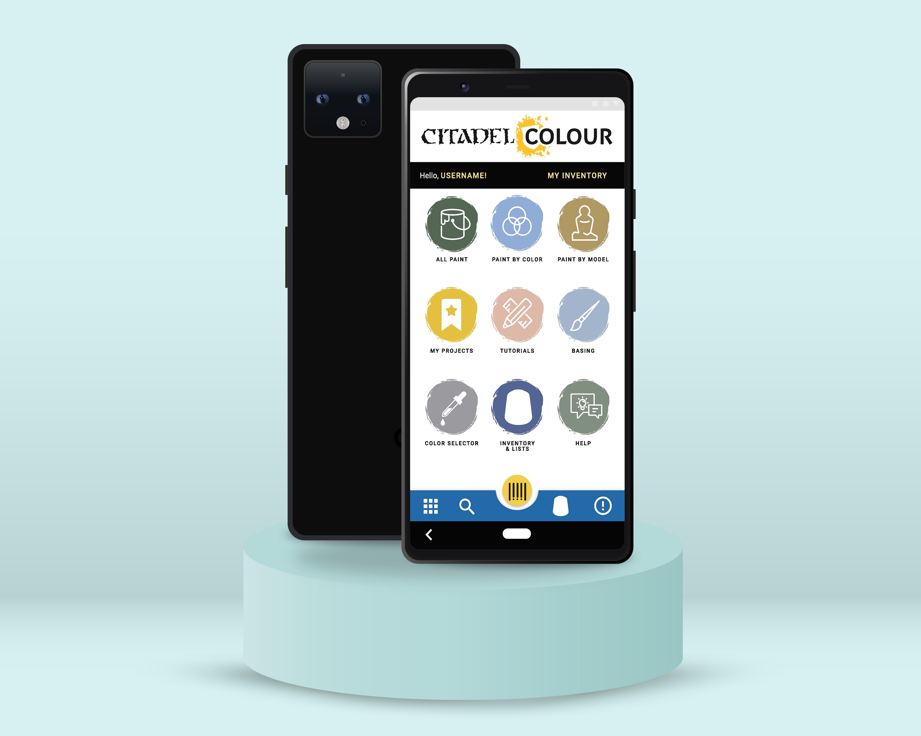
Citadel Colour is the official paint app for Warhammer miniature painters, one of the top-selling hobby categories in Europe. The app lets users browse colors, track their paint inventory, and manage a wishlist. On paper, it covered everything a miniature painter needs. In practice, users were abandoning it.
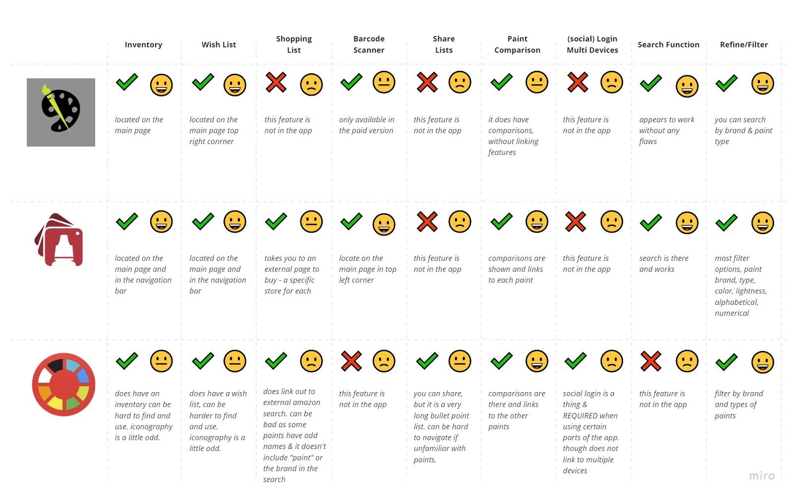
The core tension: the features users wanted most were already built. The inventory tool, the wishlist, the barcode scanner for logging paints without typing every name manually. None of it was broken. All of it was buried. The problem wasn't functionality. It was discoverability and navigation.
Key project facts:
- Survey sample: 16 participants
- Only 25% used the app regularly
- 50% said they only opened it when they remembered it existed or when it was working correctly
- 81.3% said they would use it more if their issues were resolved
research
Understanding the users
We recruited six miniature painters from the local community spanning beginner, intermediate, and advanced skill levels for 1-on-1 interviews over Zoom. Sessions were recorded with participant consent and responses were logged in a shared Google Sheet. We supplemented interviews with a broader survey of 16 participants to validate patterns quantitatively.
Findings were organized into empathy maps before being synthesized into themes across goals, pain points, current tools, and behavioral insights.
1
Only 25% of users opened the app regularly. The app had a retention problem, not a feature gap.
2
56.3% cited inventory as their most-used feature. The core value of the app was clear, we just needed to make it easier to access and use.
3
46.2% of users did not know the barcode scanner existed. The app's most powerful feature was effectively invisible,
4
The barcode scanner was hidden behind unclear navigation. Discovery required stumbling onto it -- there was no intentional path
5
Horizontal forms and unclear icons slowed task completion. UI conventions users expected were missing or inconsistent.
6
81.3% said they would use the app more if issues were fixed. High intent, low follow-through, a classic usability problem, not a motivation problem.
Key insight: Users were not disengaged because they didn't care about the app. They were disengaged because the app made them work too hard to get to the parts they cared about. Fixing navigation and surfacing existing features was the entire job.
“It would help me keep it all cataloged. So if I got out I know what I already have. I would also like to mark which ones I need to get more off.”
User interview
define
Who we were designing for
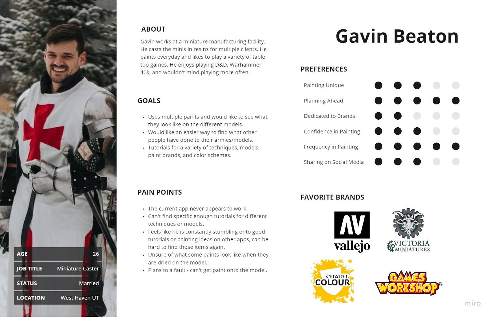
Primary user: Chris (composite persona): A hobbyist miniature painter who has a large and growing paint collection. Before a trip to the hobby store, he wants to quickly check what he already owns so he doesn't buy duplicates. He is motivated and has the right app -- but the app makes the task harder than it needs to be.
Affinity mapping themes:
- Most users expressed a clear desire for better inventory management
- Many said they would use the app more if it were more comprehensive and reliable
- Users consistently needed help finding specific features -- models, tutorials, and tools that existed but weren't surfaced
Problem statement: How might we redesign the Citadel Colour app so that miniature painters can manage their paint inventory quickly and confidently, without needing to accidentally discover the features that make it useful?
Design
From concepts to prototype
With research synthesized and a clear problem statement in place, we moved through ideation and into prototyping.
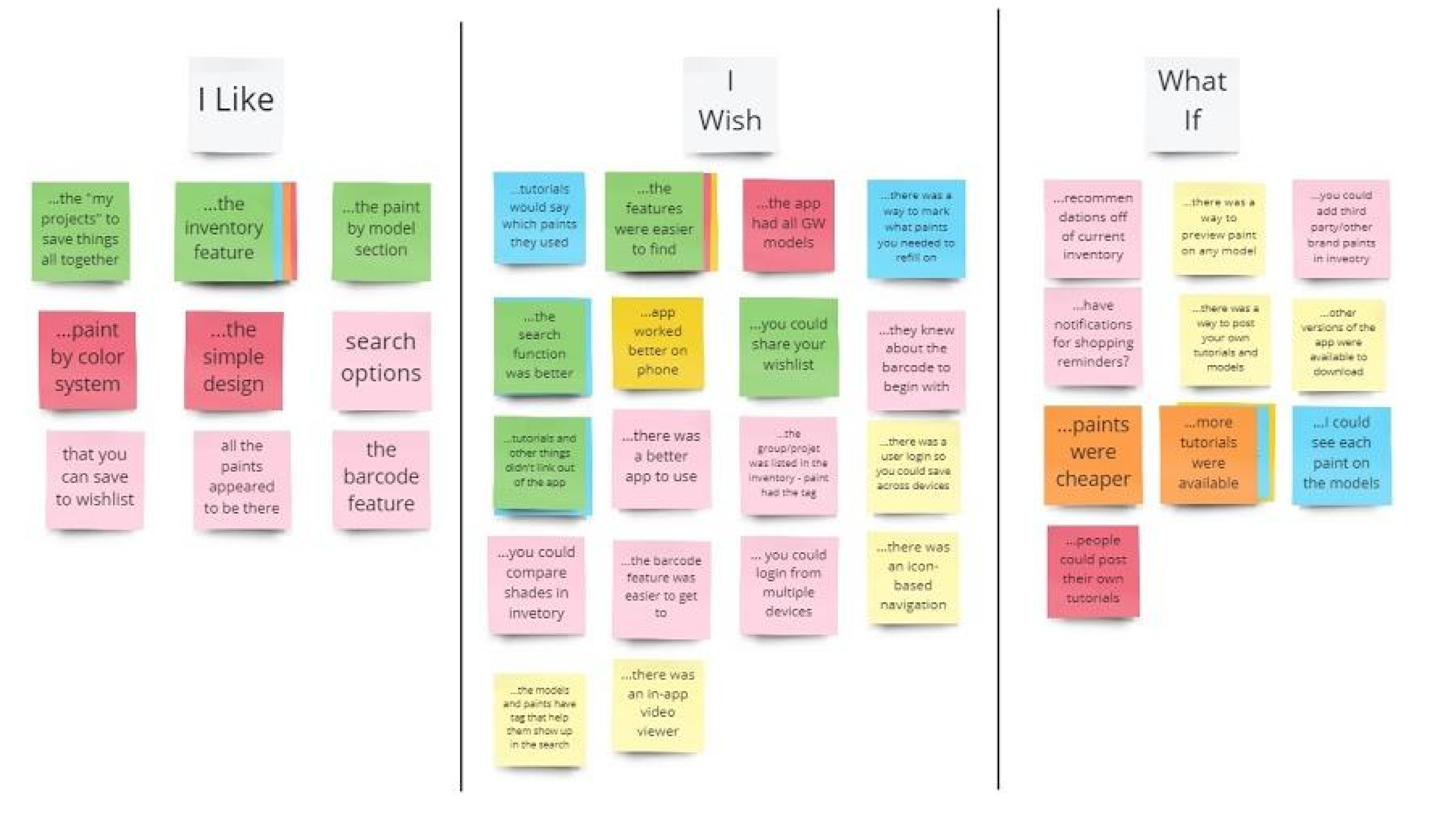
Ideation -- I Like, I Wish, What If We ran an ideation session combining user-generated ideas from interviews with team-generated ideas, then categorized everything into I Like / I Wish / What If to separate what was working, what was missing, and what was possible. This gave us a prioritized backlog grounded in real user language.
Prioritization Matrix We plotted every idea against two axes: priority (now vs later) and impact (high vs low). The matrix quickly surfaced the three features worth focusing on: the barcode scanner, the inventory tool, and the wishlist. Everything else -- social features, shopping, 3D rendering, color comparisons -- got moved to a future phase. Scoping down was the right call and the work became significantly stronger for it.
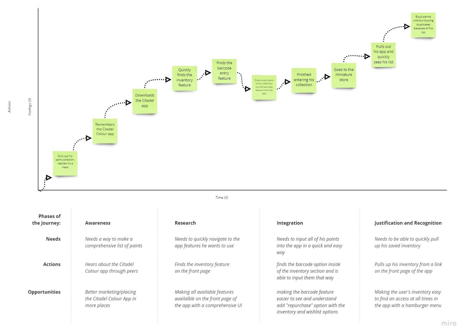
User Journey Mapping We mapped Chris's scenario end to end: arriving home with new paints, wanting to log them before forgetting, opening the app, scanning barcodes, and confirming his inventory before his next store visit. Mapping the emotional arc alongside the task flow helped us identify where the current experience created stress versus confidence.
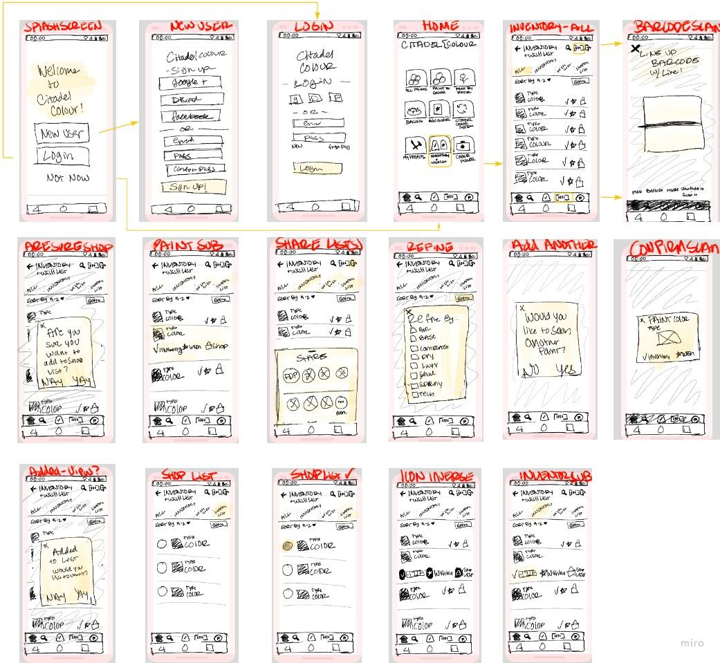
User Flow and Wireframes From the journey map we built a user flow covering all major screens and transitions, then moved into hand-drawn wireframes to explore multiple layout approaches before committing to a direction in Figma.
validate
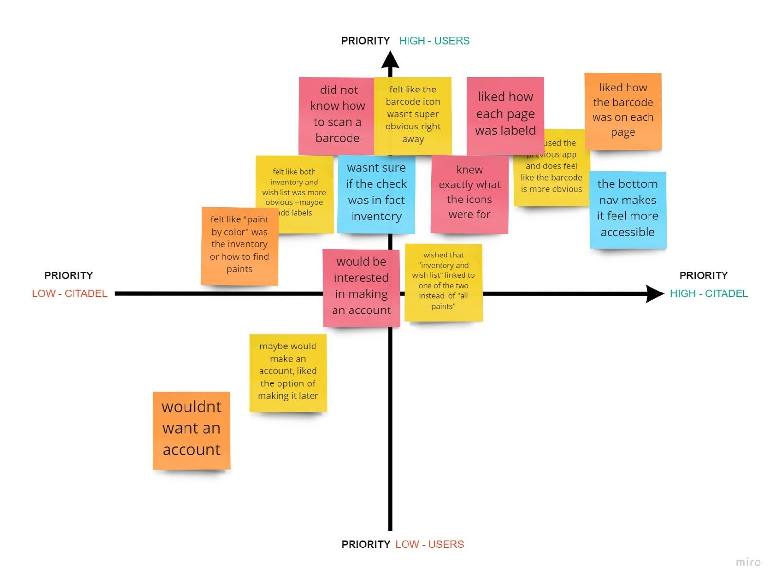
Testing & iteration
We ran guerrilla usability testing with timed, task-based scenarios across four core tasks:
- Scan a paint using the barcode scanner
- Add a paint to inventory
- Add a paint to the wishlist
- Locate inventory and wishlist items
Participants were not guided or corrected during tasks. We observed, timed, and noted where confusion occurred.
The one task failure we recorded was caused by a prototyping issue in the browser, not a design problem. Users who completed all four tasks did so without guidance and without confusion.
Finding
Change
Mandatory account creation felt like a barrier
Barcode icon (barcode + sign) was unclear
Replaced with a standard barcode icon -- immediately more recognizable
No structural changes needed -- fine-tuning only
Made account creation optional -- data saves to device without an account, syncs across devices with one
Overall navigation performed significantly better than original app
Final Design
The solution
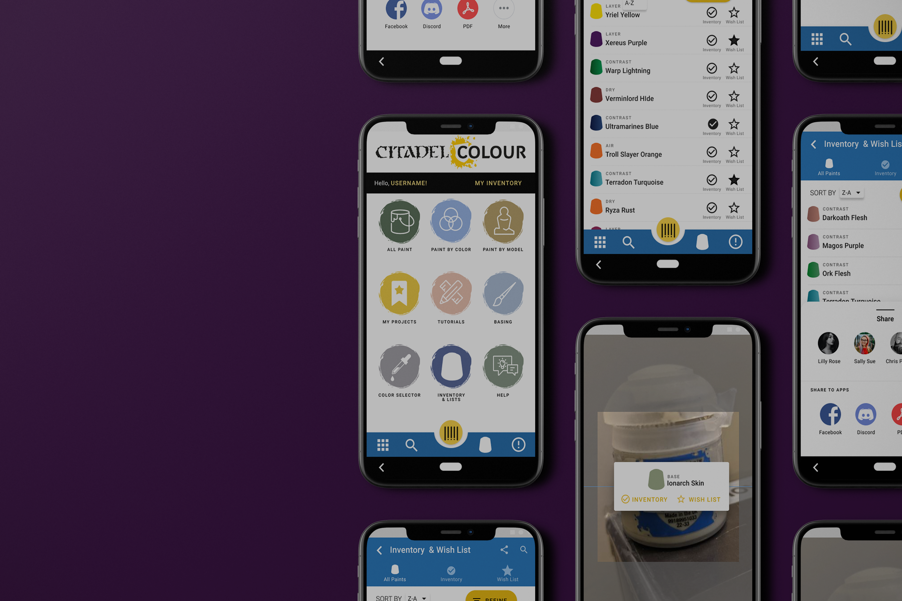
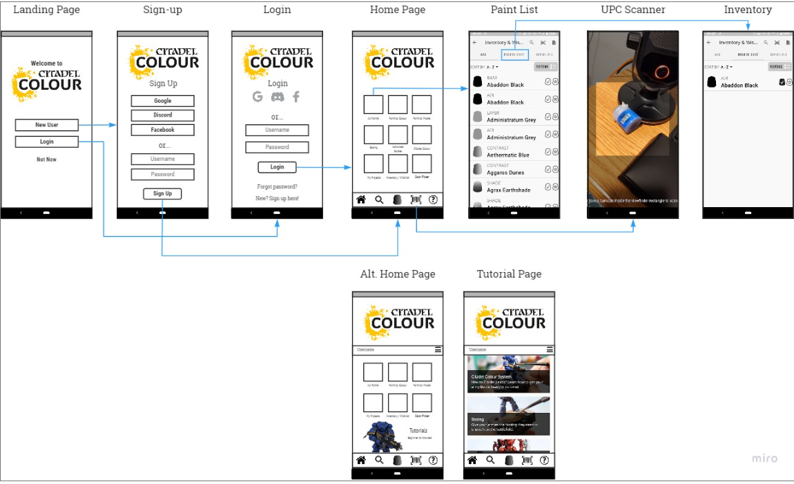
The redesign focused on three surfaces, all of which already existed in the app but were underperforming:
Barcode Scanner: repositioned as a primary action in the navigation rather than a hidden utility. Users can now scan paints directly into inventory or wishlist without searching for the feature first.
Inventory View: redesigned for clarity and speed. Users can see what they own at a glance, scan new additions in, and distinguish owned paints from wishlist paints without switching contexts.
Wishlist: surfaced alongside inventory as a peer feature rather than a buried secondary option. Users can move paints between wishlist and inventory as they make purchases.
The account system was restructured so that new users are not required to create an account to start using the app. Local device storage works immediately. Account creation is available for users who want cross-device sync, presented as a benefit rather than a gate.
outcomes
Results & impact
81.3% of surveyed users said they would use the app more if their issues were resolved. The redesign addressed every issue they named: navigation clarity, barcode scanner discoverability, and inventory usability. Users in testing found the redesigned app easier and faster to use than the original, with measurably improved task completion across all four test scenarios.
The most meaningful shift was making the barcode scanner a first-class feature. Nearly half of users did not know it existed. After the redesign, it is the primary entry point for adding paints -- which is exactly what users said they needed most.
Reflection
What I learned
The biggest lesson from this project was the cost of scope creep in the research phase. Early on, we were excited about everything the app could become -- social features, shopping integration, 3D rendering, color comparisons. That ambition led us to write interview questions that were too broad, covering territory we ultimately did not design for.
When we narrowed focus to the three core features -- barcode scanner, inventory, wishlist -- the work got sharper immediately. The reflection worth carrying forward: define your scope before you write your research questions, not after. The questions you ask shape the data you get, and the data you get shapes everything downstream.
Next steps: Two features came up repeatedly in both interviews and testing that were outside the MVP scope but worth building next. The first is a "which miniature does this paint belong to" look-up -- users want to click a color and see which models traditionally use it. The second is a color scheme helper that suggests complementary paints and helps users build a palette around a selected color. Both features would deepen the app's value for painters at every skill level.
© 2025 Savannah Nyre. All rights reserved.
Designed & built with intention.
UX/UI
App Design
Consumer
Hobby
Citadel Colour
The Citadel Colour app had a barcode scanner that almost nobody knew existed. It had an inventory feature that 56% of users said was the most important thing in the app. And yet only 25% of users opened it regularly. The idea was great. The interface was getting in the way. I led a research-to-prototype redesign focused on surfacing what was already there and making it actually usable.
My role
UX Designer
timeline
2 Months
team
2 UX Designers
tools
Figma, Miro, Adobe XD
overview
The Challenge
Citadel Colour is the official paint app for Warhammer miniature painters, one of the top-selling hobby categories in Europe. The app lets users browse colors, track their paint inventory, and manage a wishlist. On paper, it covered everything a miniature painter needs. In practice, users were abandoning it.
The core tension: the features users wanted most were already built. The inventory tool, the wishlist, the barcode scanner for logging paints without typing every name manually. None of it was broken. All of it was buried. The problem wasn't functionality. It was discoverability and navigation.
Key project facts:
- Survey sample: 16 participants
- Only 25% used the app regularly
- 50% said they only opened it when they remembered it existed or when it was working correctly
- 81.3% said they would use it more if their issues were resolved
research
Understanding the users
We recruited six miniature painters from the local community spanning beginner, intermediate, and advanced skill levels for 1-on-1 interviews over Zoom. Sessions were recorded with participant consent and responses were logged in a shared Google Sheet. We supplemented interviews with a broader survey of 16 participants to validate patterns quantitatively.
Findings were organized into empathy maps before being synthesized into themes across goals, pain points, current tools, and behavioral insights.
1
Only 25% of users opened the app regularly. The app had a retention problem, not a feature gap.
2
56.3% cited inventory as their most-used feature. The core value of the app was clear, we just needed to make it easier to access and use.
3
46.2% of users did not know the barcode scanner existed. The app's most powerful feature was effectively invisible,
4
The barcode scanner was hidden behind unclear navigation. Discovery required stumbling onto it -- there was no intentional path
5
Horizontal forms and unclear icons slowed task completion. UI conventions users expected were missing or inconsistent.
6
81.3% said they would use the app more if issues were fixed. High intent, low follow-through, a classic usability problem, not a motivation problem.
Key insight: Users were not disengaged because they didn't care about the app. They were disengaged because the app made them work too hard to get to the parts they cared about. Fixing navigation and surfacing existing features was the entire job.
“It would help me keep it all cataloged. So if I got out I know what I already have. I would also like to mark which ones I need to get more off.”
User interview
define
Who we were designing for
Primary user: Chris (composite persona): A hobbyist miniature painter who has a large and growing paint collection. Before a trip to the hobby store, he wants to quickly check what he already owns so he doesn't buy duplicates. He is motivated and has the right app -- but the app makes the task harder than it needs to be.
Affinity mapping themes:
- Most users expressed a clear desire for better inventory management
- Many said they would use the app more if it were more comprehensive and reliable
- Users consistently needed help finding specific features -- models, tutorials, and tools that existed but weren't surfaced
Problem statement: How might we redesign the Citadel Colour app so that miniature painters can manage their paint inventory quickly and confidently, without needing to accidentally discover the features that make it useful?
Design
From concepts to prototype
With research synthesized and a clear problem statement in place, we moved through ideation and into prototyping.
Ideation -- I Like, I Wish, What If We ran an ideation session combining user-generated ideas from interviews with team-generated ideas, then categorized everything into I Like / I Wish / What If to separate what was working, what was missing, and what was possible. This gave us a prioritized backlog grounded in real user language.
Prioritization Matrix We plotted every idea against two axes: priority (now vs later) and impact (high vs low). The matrix quickly surfaced the three features worth focusing on: the barcode scanner, the inventory tool, and the wishlist. Everything else -- social features, shopping, 3D rendering, color comparisons -- got moved to a future phase. Scoping down was the right call and the work became significantly stronger for it.
User Journey Mapping We mapped Chris's scenario end to end: arriving home with new paints, wanting to log them before forgetting, opening the app, scanning barcodes, and confirming his inventory before his next store visit. Mapping the emotional arc alongside the task flow helped us identify where the current experience created stress versus confidence.
User Flow and Wireframes From the journey map we built a user flow covering all major screens and transitions, then moved into hand-drawn wireframes to explore multiple layout approaches before committing to a direction in Figma.
validate
Testing & iteration
We ran guerrilla usability testing with timed, task-based scenarios across four core tasks:
- Scan a paint using the barcode scanner
- Add a paint to inventory
- Add a paint to the wishlist
- Locate inventory and wishlist items
Participants were not guided or corrected during tasks. We observed, timed, and noted where confusion occurred.
The one task failure we recorded was caused by a prototyping issue in the browser, not a design problem. Users who completed all four tasks did so without guidance and without confusion.
Finding
Change
Mandatory account creation felt like a barrier
Barcode icon (barcode + sign) was unclear
Replaced with a standard barcode icon -- immediately more recognizable
No structural changes needed -- fine-tuning only
Made account creation optional -- data saves to device without an account, syncs across devices with one
Overall navigation performed significantly better than original app
Final Design
The solution
The redesign focused on three surfaces, all of which already existed in the app but were underperforming:
Barcode Scanner: repositioned as a primary action in the navigation rather than a hidden utility. Users can now scan paints directly into inventory or wishlist without searching for the feature first.
Inventory View: redesigned for clarity and speed. Users can see what they own at a glance, scan new additions in, and distinguish owned paints from wishlist paints without switching contexts.
Wishlist: surfaced alongside inventory as a peer feature rather than a buried secondary option. Users can move paints between wishlist and inventory as they make purchases.
The account system was restructured so that new users are not required to create an account to start using the app. Local device storage works immediately. Account creation is available for users who want cross-device sync, presented as a benefit rather than a gate.
outcomes
Results & impact
81.3% of surveyed users said they would use the app more if their issues were resolved. The redesign addressed every issue they named: navigation clarity, barcode scanner discoverability, and inventory usability. Users in testing found the redesigned app easier and faster to use than the original, with measurably improved task completion across all four test scenarios.
The most meaningful shift was making the barcode scanner a first-class feature. Nearly half of users did not know it existed. After the redesign, it is the primary entry point for adding paints -- which is exactly what users said they needed most.
Reflection
What I learned
The biggest lesson from this project was the cost of scope creep in the research phase. Early on, we were excited about everything the app could become -- social features, shopping integration, 3D rendering, color comparisons. That ambition led us to write interview questions that were too broad, covering territory we ultimately did not design for.
When we narrowed focus to the three core features -- barcode scanner, inventory, wishlist -- the work got sharper immediately. The reflection worth carrying forward: define your scope before you write your research questions, not after. The questions you ask shape the data you get, and the data you get shapes everything downstream.
Next steps: Two features came up repeatedly in both interviews and testing that were outside the MVP scope but worth building next. The first is a "which miniature does this paint belong to" look-up -- users want to click a color and see which models traditionally use it. The second is a color scheme helper that suggests complementary paints and helps users build a palette around a selected color. Both features would deepen the app's value for painters at every skill level.
© 2025 Savannah Nyre. All rights reserved.
Designed & built with intention.